Don't Be Lookin' At Me!

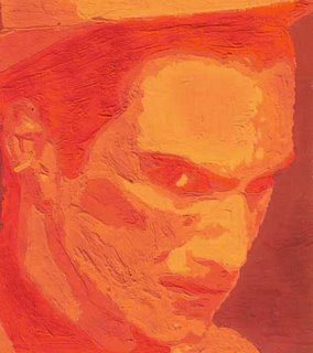
This was an analogous color scheme portrait we had to do for Color & Design class. The outline was called "angry", so I made it with reds and oranges.
There's a blank outlined face we have to work from, so it's kind of like painting by numbers, only no numbers.
I thought it looked a little van Gogh-ish once I was finished with it.
Anyway, you could say it's my first real painting, so hooray! Doug made a dirty-looking caked-on painting for class!
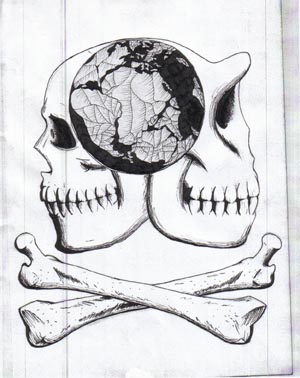
After coming down a little from the chiaroscuro compliment, I've realized that I've been neglecting deep shadows lately. Most of my anatomical sketches and drawings have been really light and could show better detail if I shadowed them a little darker. Mainly, I'm a big fucking procrastinator, and at the last minute, I decide I want to draw everything, but run out of time easily. So, I stick to vine/willow charcoals, which are easier to smear and shade with, and neglect the compressed charcoal which gives me those deep, really black shadows that I love so much. So, this is me saying that as of the skull below, I'm going to make a more concentrated effort to darken my pictures and further bring out contrasts between darks and lights, as well as to accent the anatomical features better on my figures.


3 Comments:
Wow! That's really neat. It looks like he is almost carved into stone. I like it.
LOL. I just read April's blog and I can't beileve that you actually MAILED back a burrito to Taco John's. That's classic.
I get agnry just looking at it. Grrrr....
Post a Comment
<< Home